


Here is the siggy outta it

![]() by Le Tunisien » Mar 8th, '09, 14:53
by Le Tunisien » Mar 8th, '09, 14:53


![]() by Solace » Mar 8th, '09, 16:40
by Solace » Mar 8th, '09, 16:40


![]() by Le Tunisien » Mar 8th, '09, 18:20
by Le Tunisien » Mar 8th, '09, 18:20
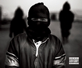
Solace wrote:Thats pretty nice man. But your text is always the same, your always putting it right at the bottom with an outer glow and bevel and emboss and using the same font. If you used a nicer sleeker font and placed it somewhere else it woulda been really dope. Like or rugged destructed font such as Capture It or something. Also the text is hard to see, like the outer glow helps see it but its still too dark.

![]() by Le Tunisien » Mar 8th, '09, 22:11
by Le Tunisien » Mar 8th, '09, 22:11
Solace wrote:http://www.dafont.com
![]() by Slim Zaddy » Mar 8th, '09, 22:24
by Slim Zaddy » Mar 8th, '09, 22:24


![]() by beeUbeeZ » Mar 27th, '09, 05:58
by beeUbeeZ » Mar 27th, '09, 05:58


![]() by Xray » Mar 27th, '09, 15:47
by Xray » Mar 27th, '09, 15:47


![]() by James R. » Mar 27th, '09, 16:30
by James R. » Mar 27th, '09, 16:30

![]() by Solace » Apr 12th, '09, 21:04
by Solace » Apr 12th, '09, 21:04
McMaybe wrote:You should make it darker.. Like, so we can't see any of it. Please.

Users browsing this forum: No registered users