by EminemBase » Sep 4th, '11, 05:46
Hmmm.
If The Slim Shady LP didn't have the writing in the corner I'd say that. The concept and actual shoot of that is the best to me as it's an idea that's from the album, which sums up the album and is the arguable conceptual peak of the album...
And it's just right there, in a realistic yet slightly abstract (due to the disclouring) photograph. It just looks artistic and great. And that is the kind of thing Eminem should be doing and which I'd expect him to be doing. It's less formulaic, more ballsy and free.
But, the 'The Slim Shady LP' writing just ruins it for me. I get the font and the fact it's supposed to look twisted and slap-happy but it doesn't blend with the background and just looks out of place over the picture like that. I think it'd be better, and perfect, without that.
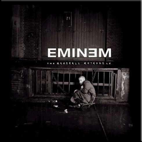
Next I'd probably have to give it to The Eminem Show. I think we're all tempted to say The Marshall Mathers LP due to how iconic the album is, and it's a masterpiece. And I think pretty much any image could be the cover and we'd intuitively feel it's special or great due to it being attached to that music in our heads. And the atmosphere of the album.
Not that the cover isn't great, but, I think I love it more than I would, simply because... it's The Marshall Mathers LP.
The Eminem Show cover however perfectly captures the theme of the album, makes it a little visual concept... even though you could make it literal also and have it be perfectly fine, and realistic. Given that Eminem really is an entertainer, who does do shows. But, the red curtains and colouring... he always 'colours' his albums...
Infinite is black. The Slim Shady LP is various blues, The Marshall Mathers LP is gray, The Eminem Show is red, Encore is blue, Relapse is orange and black and Recovery is bright breezy colours. Notice how the colours all seem to define the music too though... I've heard (no... pun? intended) that you can 'hear' in colour, and that whole concept... maybe he takes that into account, even subconsciously, when choosing colours. Or maybe wants to just separate them all visually.
But I can't think of The Eminem Show without thinking of red now. And even if I hear the music, i think of red. It's of course also tied loosely to the Batman and Robin theme / outfit. But, I think that cover is just perfect, as is the album (nearly).
The cover for Relapse is great, and creative too.
And the 'glass house' cover for Recovery is pretty ingenious. When I first thought about it I thought he didn't have that many great covers, but most of them are pretty good. But having his life on display ,symbolizing that he has no privacy and is like an animal in a cage and all that... and then, having it right in front of the GM building, with the word Recovery... that's pretty fucking good.
When he talked about the album meaning a little more metaphorically and it slightly tying in with the recovery of Detroit etc. that made it seem a lot better. The metaphorical idea of that and tying it in with his own recovery is pretty fucking brilliant. He always finds a clever little double-entendre or theme to weave an album with. But... it's a shame he didn't dedicate that idea more through the material. As it's all entirely personal.
The cover implies it beautifully, not that I'd want him to make music about GM motors lmao, but, there could of been ideas to do artisticlally to restate the theme / metaphor / tie-in.
Last edited by
EminemBase on Sep 4th, '11, 05:55, edited 3 times in total.

 i want to know whats ur favorite eminem cover (including other stuff like with D12, Curtain Call, Re-Up, ect.).... Im too tired to post the photos, so i let other people do that

 .
.


 i never seen a clean version of that cover